
Delivering reliable intelligence to our community means thinking about how to serve the entire community. Accessibility is a big part of that. As we approach our 10th anniversary (more on that in an upcoming post), we have been reviewing everything we have built over the years, to ensure it aligns with our values and vision for the future. With the help of our readers, we identified accessibility and design as key areas for improvement.
Over the last decade we have built many things that we’re proud of. We have also made many mistakes along the way! With limited resources, we have had to make trade-offs. We solved problems as they came up, and many of the design choices across our websites and emails accumulated organically. Now, we have made a concerted effort to review and refresh our design, in alignment with our news on purpose philosophy.
What we heard
In our 2026 audience survey, design and readability emerged as a top area for improvement. Colours and contrast came up frequently. “The colors of links which are hard to read early in the morning in dark mode!” one respondent wrote. “But I switch to light mode and it’s livable.” Another suggested a refresh was in order. “A more aesthetically pleasing, user friendly, and inviting website would be a huge benefit,” the person wrote. “It looks a little better in ‘light mode’ as opposed to ‘dark’ but I think refresh would be great.”
We are grateful for the feedback. It helped us prioritize this work and make sure we were focused on the right things.
Our approach
We’re not experts in accessibility or design, and we remain resource-constrained. But we’re curious, and as journalists, we know a thing or two about research and iteration. Those skills served us well as we dove into this project.
We decided to focus on incremental improvements rather than a complete redesign. While we did make improvements across our news, calendar, and vote sites, we focused most of our attention on the news site, where the majority of our readers spend their time.
To guide our work, we leaned on the Web Content Accessibility Guidelines (WCAG) and the Accessible Rich Internet Applications (ARIA) standards. We used several tools to audit our sites and ensure we were making meaningful improvements along the way, including Lighthouse, axe, and IBM’s Equal Access Checker. We also did some testing with NVDA, a popular screen reader.
What we changed
We made dozens of changes across our websites and emails, but several bigger ones are worth highlighting.
We started with colour. Pink was a very intentional choice when we started Taproot. After we settled on the concept of a taproot, we thought about which plant might represent it best. We chose the radish, in part because they grow well in the Edmonton region, and in part because they are pink. We wanted something different from the usual red, green, blue, and orange that you typically see in media and politics.
However, the specific shade of pink we chose was not very intentional. We used some stock art for an early mockup and simply adopted the pink from that. We didn’t think about contrast or readability at the time. We were too busy trying to get Taproot off the ground! Over time we brought in other colours, but again without much thought to how they worked together or how they affected readability.
We have now selected a new primary pink and developed a palette of supporting colours that improves contrast and readability across light and dark modes. This addressed a lot of the issues the accessibility tools flagged.
Next, we moved on to typography. We decided to keep the same fonts, but we did adjust the colours, weight, spacing, line width, and other details that affect the readability of our work. We also cleaned up our logo, adjusting its spacing and applying the updated colours.
Other changes we made to the websites include:
- Headings now follow the correct hierarchy and are used appropriately. We had been using heading levels in some places purely for styling, which creates problems for people who navigate with assistive technology.
- We added skip-to-main-content links, so keyboard and screen reader users can bypass navigation and get straight to the content.
- We simplified page layouts by removing redundant “Read the story” links and other unnecessary elements.
- Ads are now consistent across the site and emails, so they look and behave the same way everywhere.
We also refreshed our email templates. Over time, they had become brittle as we tweaked things by hand, one change at a time. We now have a repeatable pipeline that makes it easier to update templates consistently and reliably.
We tried to take what we did on the web and apply the same principles to email. That is harder to do than it sounds, as email client support is varied and limited in ways the web is not. Still, we managed to make some important contrast and readability improvements in our emails, while also making them more consistent with the web experience.
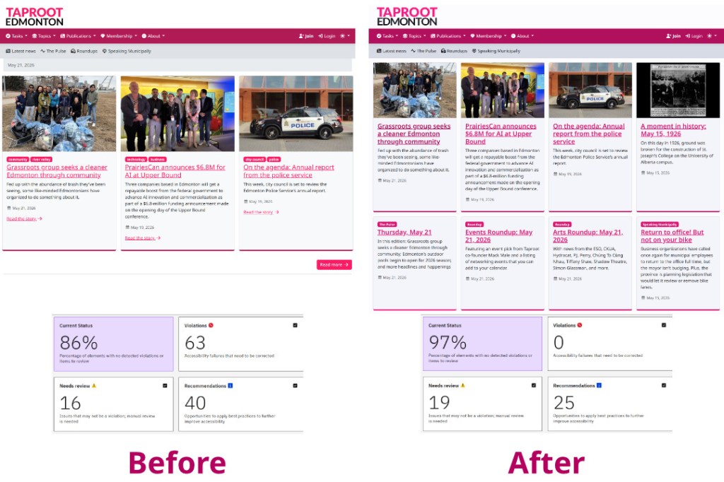
The impact
Our accessibility score on Lighthouse improved from 84 to 100 on our home page, and from 91 to 100 on a typical article page. We also saw significant decreases in the number of issues flagged by other tools, in most cases from dozens to zero.
This is great progress! But we know there is more to do. Accessibility is an ongoing commitment, and we will continue to make improvements.
Undertaking this work has also led us think more deeply about how the products we build serve our community and our mission. We have lots of ideas for how to improve our websites and emails in ways that go beyond accessibility, and we look forward to sharing those with you in the coming months.
We hope these accessibility improvements make Taproot easier to use for everyone, whether you rely on a screen reader, have low vision, prefer dark mode, or simply want a less cluttered reading experience.
Let us know what you think of the changes!
